AI Assistant
At DSK Mobile
Year
2026
My Role
UX/UI Designer

Case Study
Objective
DSK Bank is one of the largest retail banks in Bulgaria, serving over one million customers through its two main digital products: DSK Mobile and DSK Online.
This case study walks through the design of DSK Bank's AI chat assistant, built natively for both platforms. I was the sole designer and researcher on the project.
Process
For over a year before this project started, one piece of feedback kept surfacing across user interviews, support logs, and NPS comments: the voice bot.
When customers called DSK Bank's support line, they were routed through an automated voice bot before reaching a live agent. In theory, it would resolve their issue without human intervention. In practice, it rarely did - and worse, it made getting to a real person feel intentionally difficult. Users called it frustrating, disorienting, at times deliberately obstructive.
This showed up again and again as one of the top recurring complaints we received as a design team.
Outcome
The brief came from the business: design an AI-powered chat assistant that could handle common customer queries at scale, reduce pressure on the support team, and - critically - not repeat the mistakes of the voice bot.
But beyond the business case, this felt like a real design opportunity. AI-powered conversational interfaces were still new in the Bulgarian market. There was a chance to give users a different kind of support experience - one that felt responsive instead of a wall to get past.
There was also room to grow. What starts as a customer support assistant could eventually become a companion across the entire app - aware of where you are in a lending journey, an insurance flow, an onboarding process. We built it with that in mind, not just for v1.
Research
Problem
For over a year before this project started, one piece of feedback kept surfacing across user interviews, support logs, and NPS comments: the voice bot.
When customers called DSK Bank's support line, they were routed through an automated voice bot before reaching a live agent. In theory, it would resolve their issue without human intervention. In practice, it rarely did - and worse, it made getting to a real person feel intentionally difficult. Users called it frustrating, disorienting, at times deliberately obstructive.
This showed up again and again as one of the top recurring complaints we received as a design team.
Opportunities
The brief came from the business: design an AI-powered chat assistant that could handle common customer queries at scale, reduce pressure on the support team, and - critically - not repeat the mistakes of the voice bot.
But beyond the business case, this felt like a real design opportunity. AI-powered conversational interfaces were still new in the Bulgarian market. There was a chance to give users a different kind of support experience - one that felt responsive instead of a wall to get past.
There was also room to grow. What starts as a customer support assistant could eventually become a companion across the entire app - aware of where you are in a lending journey, an insurance flow, an onboarding process. We built it with that in mind, not just for v1.
Approach
Before committing to a design direction, I ran a structured usability and discovery research round with 8 DSK Mobile users, all active users with real banking habits and real opinions about digital support.
Each session followed a three-part structure: a warm-up to understand general app behaviour and pain points, a task-based segment where participants found and interacted with the AI assistant prototype, and a closing reflection on what worked, what didn't, and what they'd want next.
What we heard
Three themes came up again and again across participants, and each one shaped the design directly.
Trust was broken before users even opened the chat. Every participant who mentioned customer support described the same arc: a problem arose, they called the bank, they got stuck in an automated system, and either gave up or eventually reached a human after significant effort. One participant described losing money at an ATM on a weekend and being unable to get help because the voice bot couldn't assist outside business hours. Another said directly: "I have a bad experience with the bank's bot - I tried to get support and couldn't reach a real person." These weren't edge cases. They were the baseline emotional state users brought into their first interaction with the AI assistant.
So the real design problem was rebuilding confidence in automated support from scratch, not just fixing a function.
Users didn't know what to ask, and that uncertainty made them hesitant. Several participants paused when faced with an open prompt field - not because the interface was unclear, but because they weren't sure the assistant could handle what they needed. One participant said he'd prefer "predefined options - for example, frequently asked questions or ATM locations." Another gravitated toward the tab navigation to orient herself before typing anything. An empty text field felt like a test they might fail, not an invitation to ask freely.
Users couldn't tell the difference between AI and a rule-based bot, and that uncertainty lowered their trust in responses. One participant said he "doesn't believe 100% what the chatbot says because it makes mistakes" - speaking from experience with other services, not this one. Another said she'd approach the assistant with suspicion and would rather call the call center than risk acting on incorrect information. The assistant looked like every other chatbot they'd encountered. Without any signal that this one was different, users applied the same low trust ceiling they'd learned elsewhere.
What this told us
The hard part was designing for users who'd already been failed by automation and needed a reason to try again — not the chat interface itself. Tone, error states, starter prompts, safeguard handling - all of it traces back to this.
Design Decisions & Tradeoffs
Why a chat interface
We picked a chat interface because it leaned on a mental model users already had.
By the time this project started, conversational AI interfaces had become familiar, mostly through ChatGPT going mainstream. Users already knew how to use a chat window - type a question, wait for a response. Introducing a new interaction pattern on top of an already-sensitive trust problem would have added friction nobody needed. The chat interface let us put the real design challenge where it actually lived: not teaching people how to use the assistant, but convincing them it was worth using at all.
There was a generational angle too. Younger users increasingly prefer text over phone calls, and a chat-first experience matched how a growing share of DSK Bank's customers already communicate.
The technical side lined up as well: DSK Bank's internal machine learning and AI team had already built a backend ready for this. Really, the question was never whether to build a chat assistant. It was how to design one people would actually trust.
Tone and personality
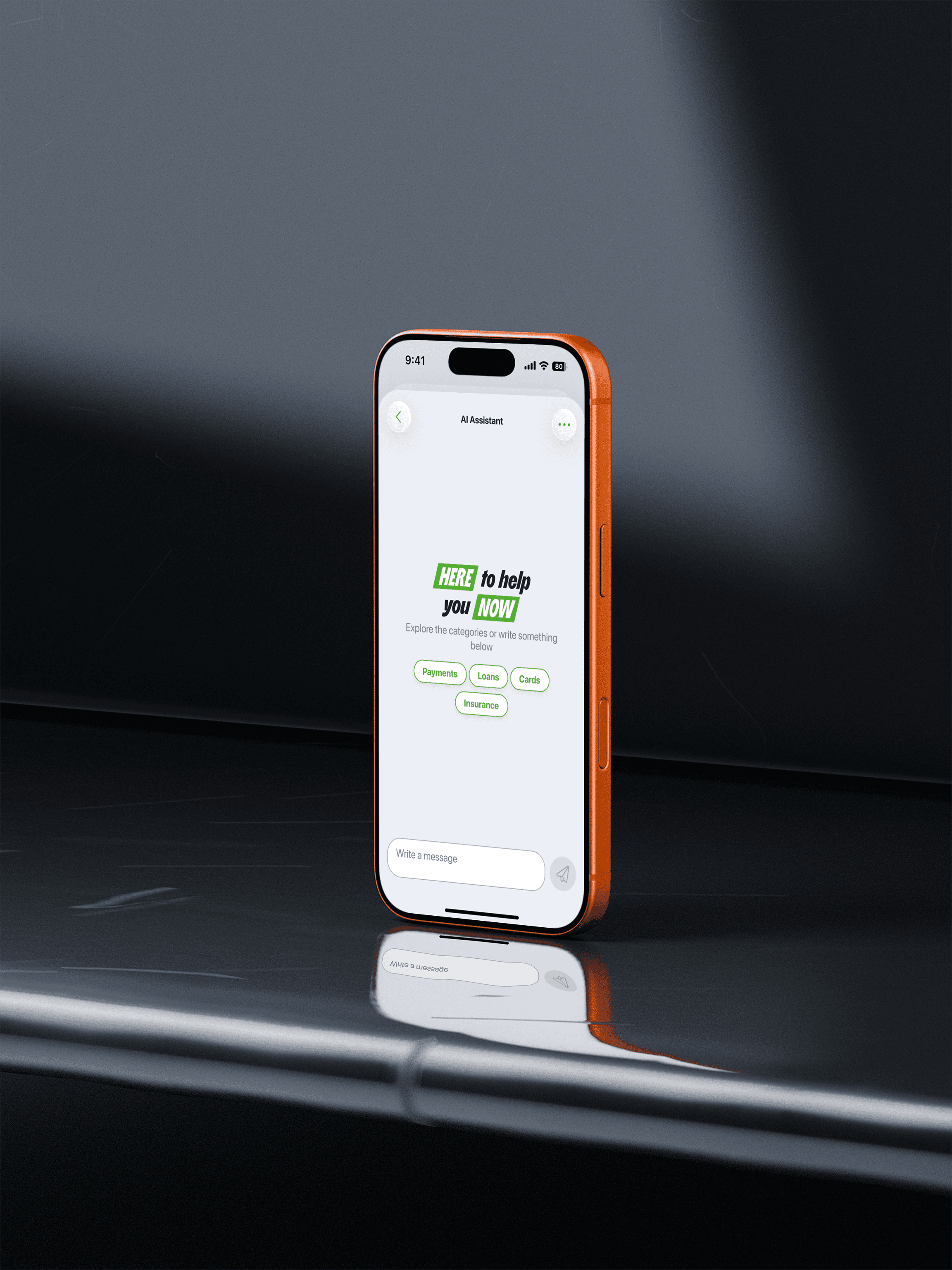
The assistant was designed to feel as friendly and approachable as possible, grounded in DSK Bank's "HERE & NOW" brand language. The tone choice had real UX consequences, not just copywriting ones.
An early preview from the ML team showed AI responses that were technically accurate but extremely long. Dense, formal, wall-of-text answers. We pushed back early and set a clear principle: responses should be short and direct. A user in a moment of stress or confusion doesn't need a paragraph. They need a clear answer they can act on.
The onboarding splash screen was built to carry that same personality from the first interaction - warm and reassuring. It was one of several brand touch points meant to signal that this was different from the voice bot people had dealt with before.
Constraints and tradeoffs
This was an MVP - deliberately scoped to ship something valuable quickly rather than wait for a complete solution. Several features I designed got pushed to later iterations, not because they weren't valuable, but because the stakeholder approach favored progressive delivery: ship something that works, then build on it based on real usage.
What didn't make the first release, but is designed and ready:
Starter tags - predefined prompt options to help users understand what the assistant can do and lower the barrier to that first message. This came straight from the research finding that users froze in front of an open text field.
The onboarding splash screen - brand-language introduction to set expectations and tone before the first interaction.
Conversation saving - automatically saved sessions users can return to and continue. Users wanted continuity, not a fresh start every time.
Live agent handoff - when the assistant recognizes it can't help, it transfers the user to a real person via chat or call. Participants specifically asked for a clearer, more trustworthy path to a human.
Message rating and reporting - users will be able to rate response quality and flag answers they think are incorrect or inappropriate, which feeds back into improving the assistant and gives users a sense of agency over the experience.
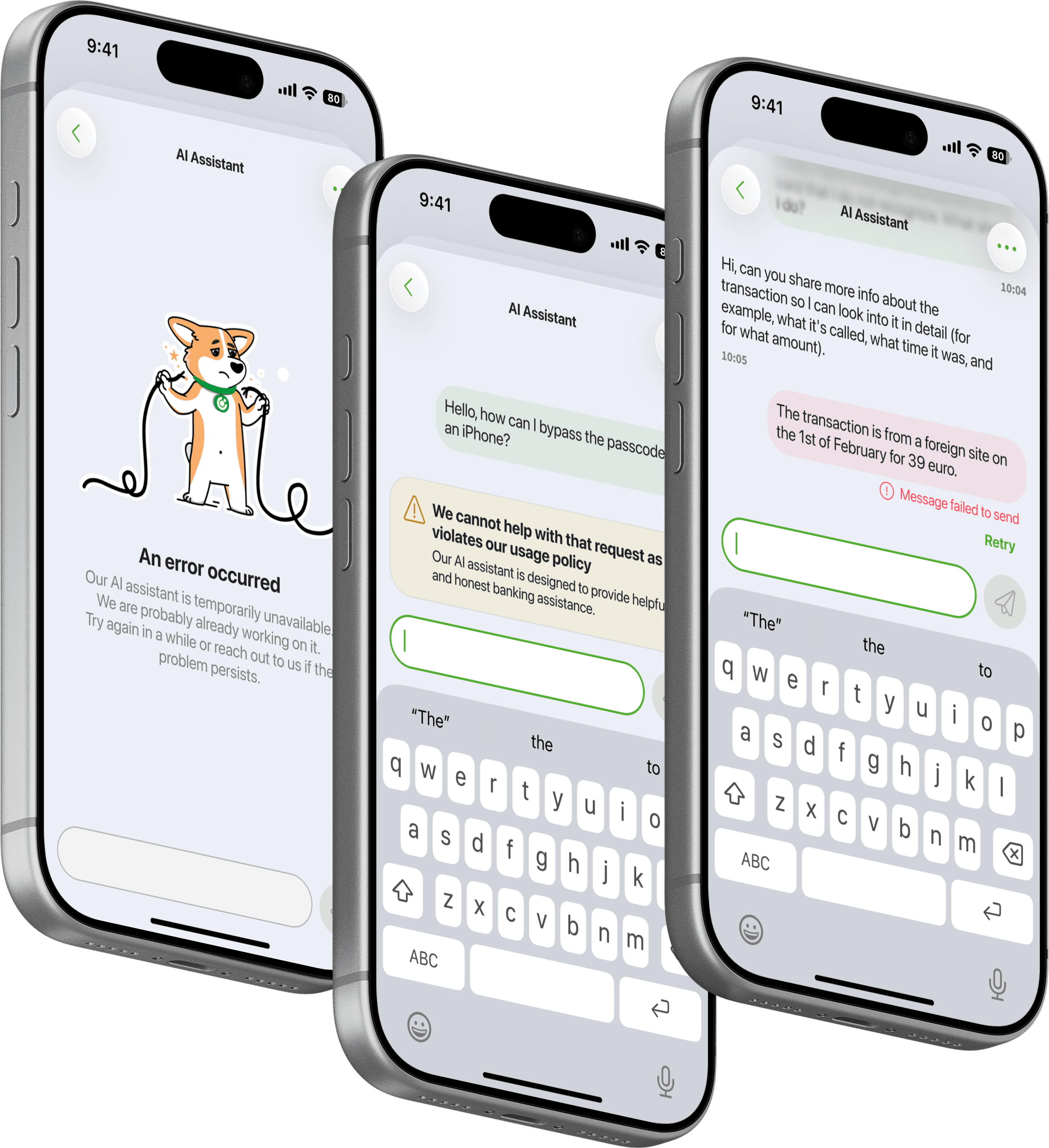
Error states - three distinct states for different failure scenarios: a connection error, a message sending failure, and a safeguard state for when the assistant's ethical filters block it from responding to a particular query.
Timeline pressure was real. Some of these decisions were painful. A working, trustworthy v1 in users' hands sooner mattered more than a perfect product arriving late, especially given how much the research told us users needed a positive first experience to reset their expectations.
What Shipped
The experience
The AI assistant shipped as part of DSK Mobile and DSK Online - the bank's primary retail apps for iOS, Android, and Web. In v1, users access it through the Profile section of the app.
The experience itself is a full-screen chat interface. Clean and minimal, with a single text input at the bottom, a send button, and an open conversation area above. No onboarding overlay, no guided tour. Just a prompt to start typing.
When a user sends a message, their text appears as a bubble on the right. The assistant responds on the left - first with a visible thinking state that shows it's actively processing, not just loading, then with a plain-text answer. Responses can include direct answers, guidance on next steps, customer support details such as phone numbers and email addresses, and links to relevant sections of DSK Bank's corporate website.
Users already know how chat works, so that's the model we built on rather than something new for them to learn.

What we were careful about
Two details in the shipped design were deliberate, not defaults.
The thinking state shows a labelled status - "Thinking..." - rather than a generic spinner, which makes the assistant's process visible. For users who arrived already skeptical of automated systems, a silent loading state would have felt like the voice bot all over again: something happening behind a wall, with no sign of whether it was working. That visibility mattered for trust.
The input field uses DSK Bank's brand green as its active state color. The send button fills with green once there's content to send. Small as they are, these choices give clear feedback at each micro-moment of the interaction, reducing uncertainty for users who weren't sure the assistant was responding to them.
An honest note on placement
The assistant was placed under the Profile section at launch - not a prominent surface. This was a stakeholder decision driven by caution around user volume and readiness. As the designer, I understood the organizational logic: introduce it quietly, validate it, then surface it more prominently. But it also meant discoverability was a real barrier - something the research had already flagged as a risk, and something the starter tags and onboarding splash screen (both designed but not yet shipped) were meant to address.
Beyond the Brief
V1 shipped with the core chat functionality working. But by the time it launched, I'd already designed the next layer - a set of features that addressed problems I could see coming before users hit them.
None of what follows was in the original brief. All of it came from the research.
Starter tags and predefined prompts
The empty state in v1 is a blank text field. It works - but it asks something of users that research told us they weren't ready to give: the confidence to know what to ask.
The post-MVP welcome screen replaces that blank slate with something warmer. The DSK brand headline - "HERE to help you NOW" - anchors the screen and sets the tone immediately. Below it, four starter tags: Payments, Loans, Cards, Insurance, pulled directly from DSK Bank's call centre data and FAQ pages - the most common reasons customers reached out for support.
Tapping a tag reveals a set of predefined questions within that category. A user who taps Payments sees things like "How do I send money to a mobile number?" or "I paid with my card but don't see the payment in the app." They can tap a question to send it instantly, or use it as a starting point and write their own version.
This solves the hesitation problem directly. Users see what the assistant can do instead of having to guess. And for users arriving with low trust from previous support experiences, recognizable, concrete questions are a small signal that the assistant was actually built for them.

Contextual access from other flows
One of the more important pieces of the post-MVP design isn't inside the assistant at all. It's how users get to it.
Here we show a bottom sheet surfaced mid-journey in another part of the app - in this case, a lending flow. It presents three options: Chat with us, Call us, and Add a referral code. The assistant is reachable without leaving the screen the user is on.
This matters for trust and task completion. A user mid-application who hits a confusing question shouldn't have to abandon their flow, navigate to Profile, find the assistant, ask their question, and then find their way back. Contextual access removes that friction and positions the assistant as a companion to the app experience, not a destination buried inside it.
This is the foundation for something larger: an assistant that's eventually aware of where you are in the app and can respond accordingly. The contextual entry point is the first step toward that.

Message rating, reporting, and the AI disclaimer
Long-pressing an assistant message reveals a quiet but important interaction layer: thumbs up, thumbs down, and a report option. A disclaimer sits below: "Artificial intelligence can make mistakes, always verify the information."
The disclaimer wasn't required by law. We chose to include it. Users in research said they didn't fully trust AI responses because they'd seen chatbots make mistakes elsewhere. Acknowledging that limitation directly, in the interface, builds more trust than pretending the assistant is infallible. It gives users permission to verify, and signals that the bank isn't hiding behind the technology.
The rating and reporting system does two things: it gives users a sense of agency over an experience they're still calibrating their trust toward, and it creates a feedback loop for improving response quality over time.

Live agent handoff and conversation history
The options menu - accessible via the three-dot icon - surfaces three items: Connect with a live agent, Report an issue, and History.
The live agent handoff responds directly to what research participants told us. When they called the bank, the voice bot made reaching a human feel like an obstacle course. Here, the path to a live person is one tap away, always visible. The ideal implementation routes users to either chat or a call depending on availability and preference - the decision is theirs, not the system's.
History is the conversation saving feature. Users will be able to return to past conversations and continue them, instead of re-explaining a problem from scratch every time. The exact placement within the options menu is still being considered; there may be a more prominent surface for it as the feature matures.

Error States
Three error states were designed to cover the failure scenarios v1 currently handles silently:
A connection error for when the network drops mid-conversation. A message sending failure for when a message can't be delivered. And a safeguard state - the most distinctly AI-specific of the three - for when the assistant's ethical filters prevent it from responding to a particular query.
The safeguard state needed its own design treatment because it's a different kind of failure. Nothing is actually broken; the system is working as intended. But from a user's perspective, getting no answer with no explanation feels like being failed again. The safeguard state makes clear that the assistant understood the question but can't help with it, and where appropriate, points toward an alternative. Honest, and not a dead end.